Filter Chart Within Dashboard At Runtime
![[Deleted User]](https://w4.vanillicon.com/v2/405e65ccf7b995f883e9718428cf100b.svg)
Is there an option to filter a chart within a dashboard at runtime the same way we can filter a report at runtime?
Comments
-
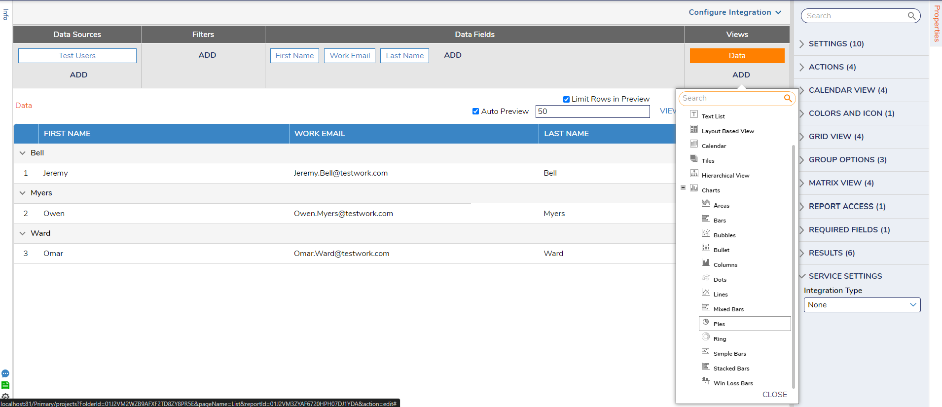
This is possible by adding the desired chart type under the Views option at the Report level. The report will need to be grouped by a column first to ensure the chart knows how the data will be visualized. We currently have 13 options to choose from. The documentation here has an in depth description with steps to add charts to a report: https://documentation.decisions.com/docs/adding-charts-to-a-report
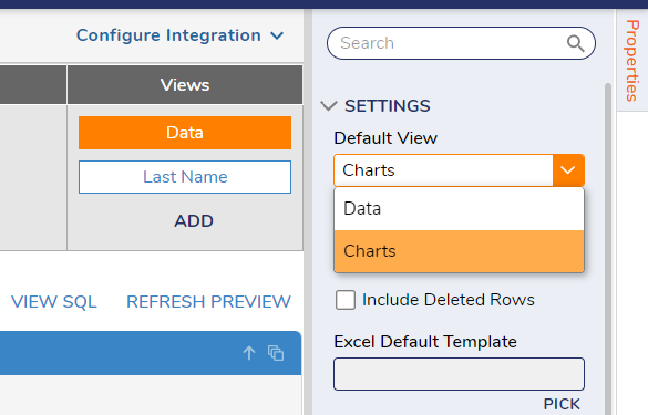
Once the proper chart view is chosen, choose Data view and configure the Default View under Settings to Charts.
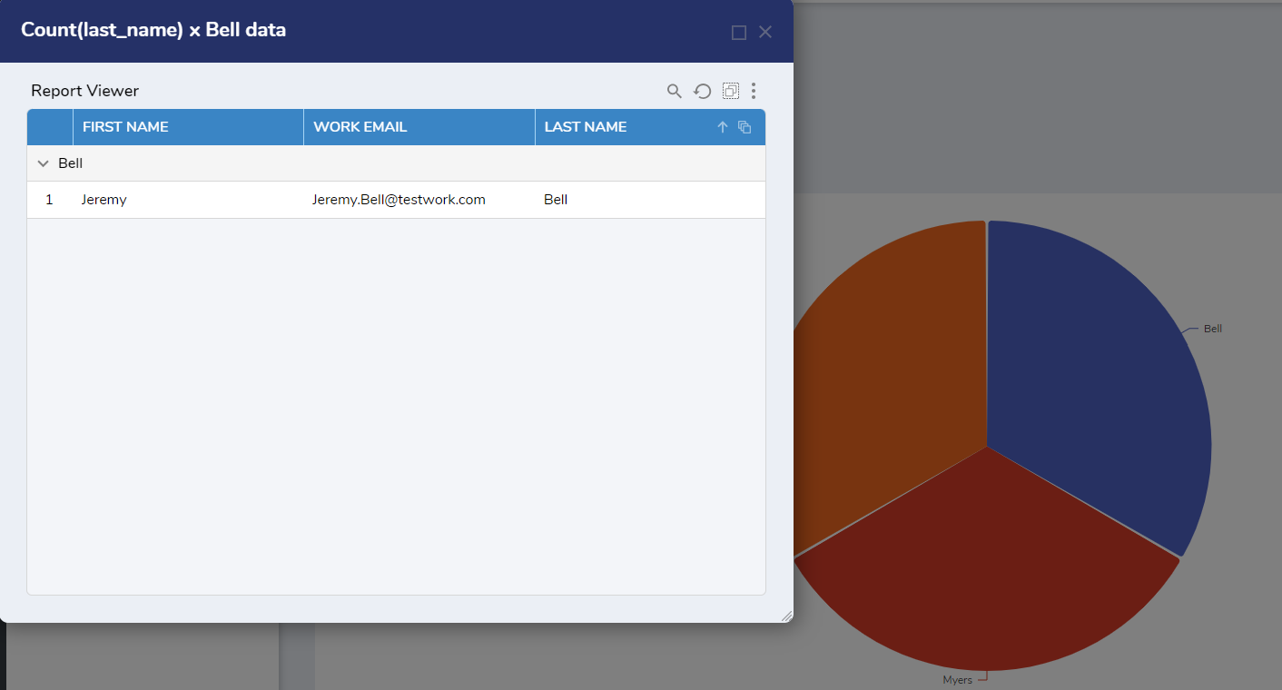
A popup window will appear of the sorted field when clicked on.
Please see a simple project showcasing this below:
Please Note: The examples attached were developed to be instructional, and were not developed as officially supported components. For more information or to engage our service team to develop fully supported, production quality solutions, please contact: services@decisions.com.
0
![[Deleted User]](https://wa.vanillicon.com/v2/afc3a198b6337c4c433ae70b6b323525.svg)
Howdy, Stranger!