Make Stacked Bars Chart stack with gropued values

Comments
-
My goal is to show the division of entity states for each week.
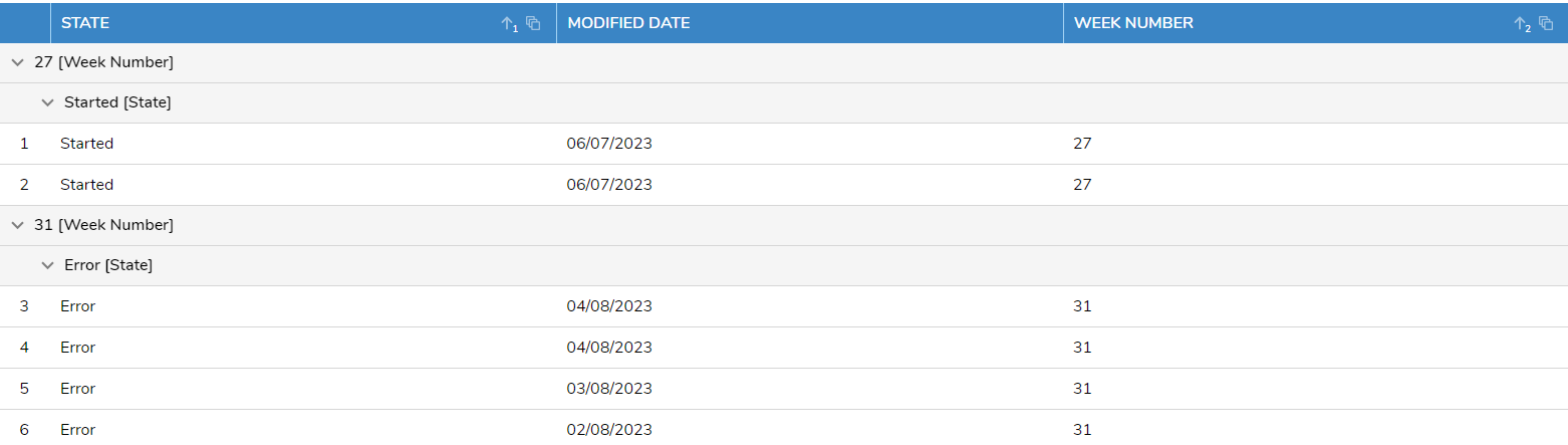
I have a hard time getting the chart to stack as I expect it to.Currently I have a report, grouped first by week number and then by the entity state:
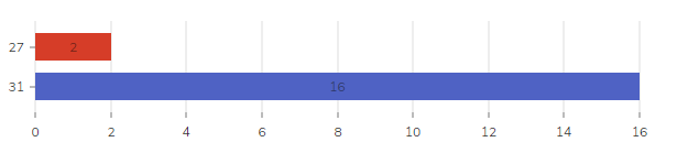
This can give me a stacked bars chart where I can open up each row to show the division:
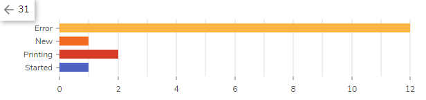
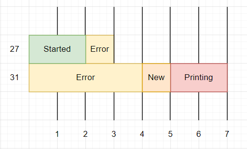
What I expect is something like this, with no need to "go to" each row to see the values:
What I am missing to make this happen?
36007 -
Hey PatrickS
So Ive been looking at this for a bit, and there is a way to get a stacked bar graph that displays how you want it to. However, you would need to create another datatype that holds the counts for each week, like this:
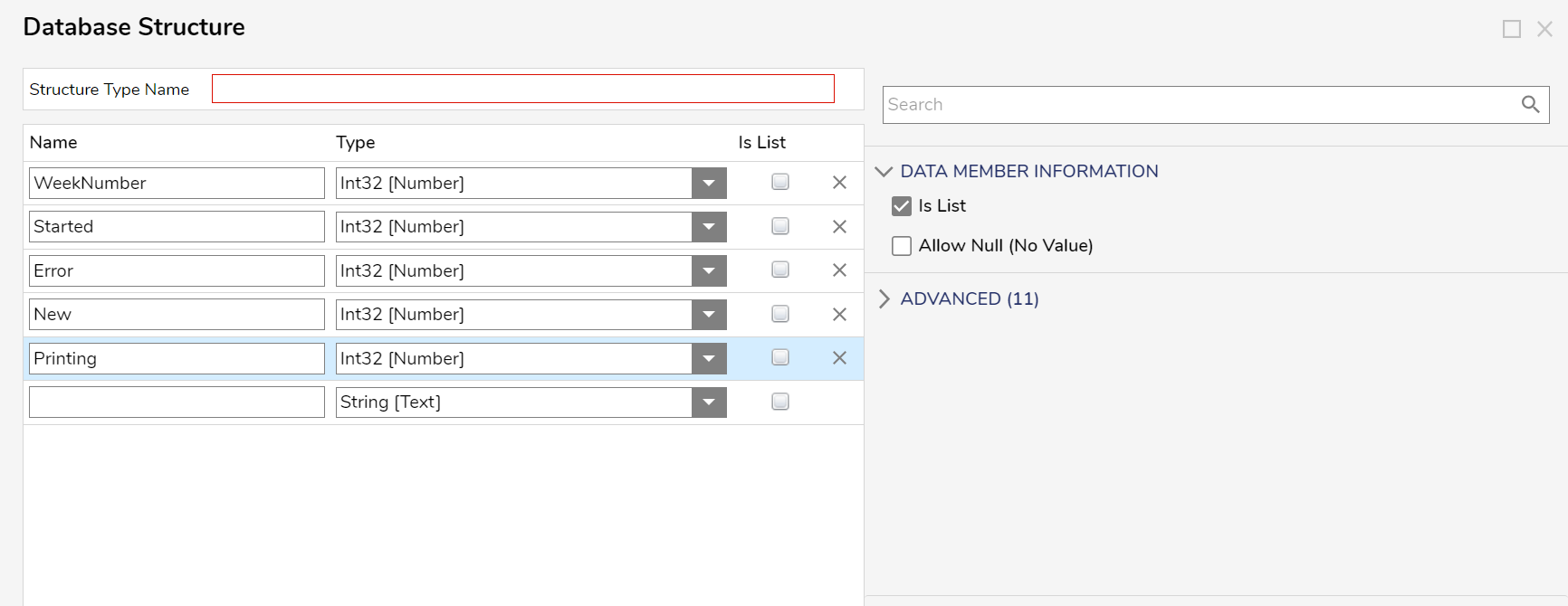
This will allow us to run a report off this and create the stacked bar graph you want.[color=#ff0000]I should caution you now that to fill in this structure with all the necessary data each week will take some sort of flow. So this approach may not be as performant as what you currently have.[/color]
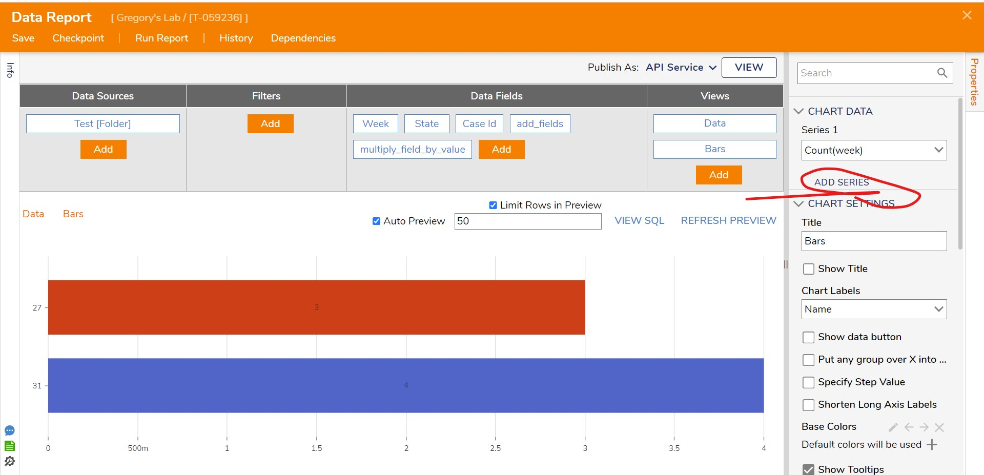
Next, make a report off this data by clicking "Create Report" and add a "View". Select "Stacked Bars"
After that, add some series, as shown below (this is modeled off your old dataset, not the current one being suggested to build):
And that should do the trick! If you have further questions, please reach out to us anytime!
36026